Last June, I had a great time doing #30DaysWild, and I drew a little doodle or sketch each day to show what I’d got up to. It seems that some of the folks at the Wildlife Trusts appreciated my little pictures, because they asked me if I’d like to do the illustrations for the Random Acts of Wildness cards in this year’s pack. Of course I wanted to! How cool is that?! Anyway, I thought some of you might be interested in hearing a bit about the cards - thanks to Mags (of With Each New Day), Helen (of Stresswitch) and notso (of Bus-Stop Birding) for the following questions. If you’ve got other questions, feel free to ask in the comments.
What determined your choice of subjects? Did you think of the acts yourself or were you given a list?
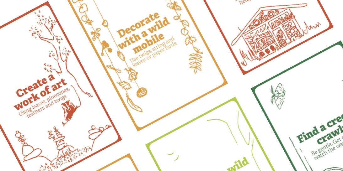
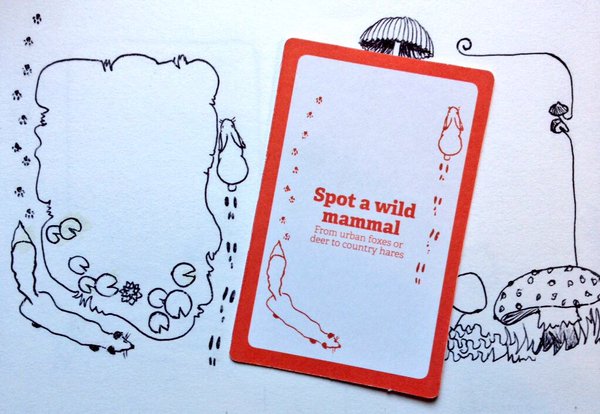
I liaised with the fabulous Lucy McRobert at the Wildlife Trusts and she sent me a list of activities, along with some instructions about the shape and layout of the cards. Other than that I was left mostly to my own devices, which suited me. It was a nice way of working, to be free to think about the story I’d like to create around the text on each card. Some of the pictures are straight up illustrations of the text, others work in tandem with the statements.
On the other hand, this freedom meant that when I got stuck with what to draw, it took a lot of thinking to get me out of my pickle - I didn’t have many pointers! But, as is so often the case with creative things, some of the pictures that puzzled me the most ended out being my favourite illustrations. I had a hard time figuring how to illustrate "Google wild facts" without just showing a person at a computer. Hopefully the end result, although slightly fantastic, shows how research can bring ideas to life, off a screen and into reality (or at least into imagination).
On the other hand, this freedom meant that when I got stuck with what to draw, it took a lot of thinking to get me out of my pickle - I didn’t have many pointers! But, as is so often the case with creative things, some of the pictures that puzzled me the most ended out being my favourite illustrations. I had a hard time figuring how to illustrate "Google wild facts" without just showing a person at a computer. Hopefully the end result, although slightly fantastic, shows how research can bring ideas to life, off a screen and into reality (or at least into imagination).
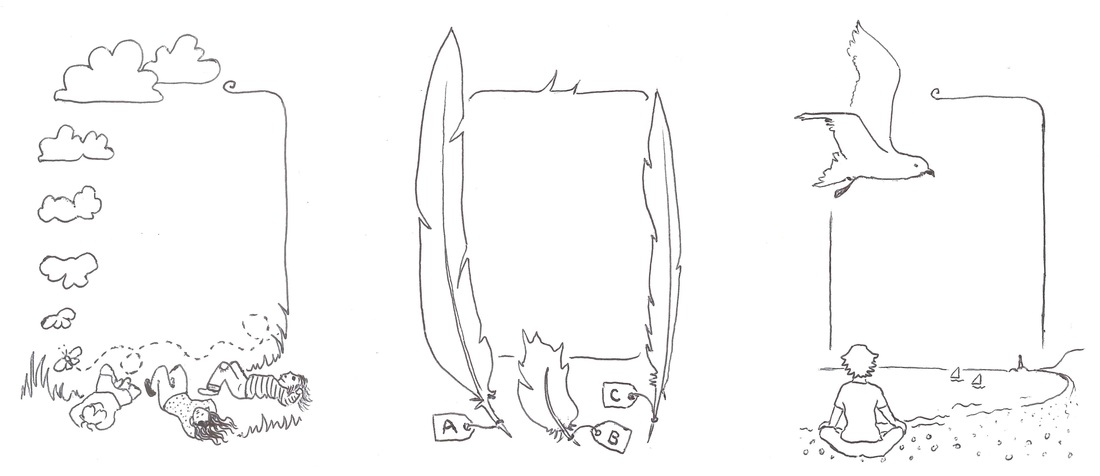
The first few illustrations had borders on them, but these were ditched (which made life easier for the designers and for me).
Did you work on the art at the location or from photos? Were any of the cards inspired by specific locations?
I was doing most of these illustrations in February and March, when it was cold and bleak and I was not surrounded by the flora and fauna of summer. This was one of the most difficult parts of the process. I couldn’t walk outside and think, “Oh, that’s an interesting flower,” and draw it. I had to try to remember what kinds of flowers or fungi or birds are around in June, then find images of them to work from - photos, diagrams, other illustrations. Inevitably, that meant I was limited to the things I could remember names for, or which showed up in my many Google searches on variations of “wildflowers in Devon” or “fungi UK June” or “summer migrant birds Scotland”. I also drew on the pictures I did during #30DaysWild in 2015, and on my photos from the last few summers, using them as inspiration.
(Incidentally, I just read this great conversation between Sarah Perry and Amy Liptrot at Caught by the River, which includes a discussion about the difficulties in writing out of season - I can relate!)
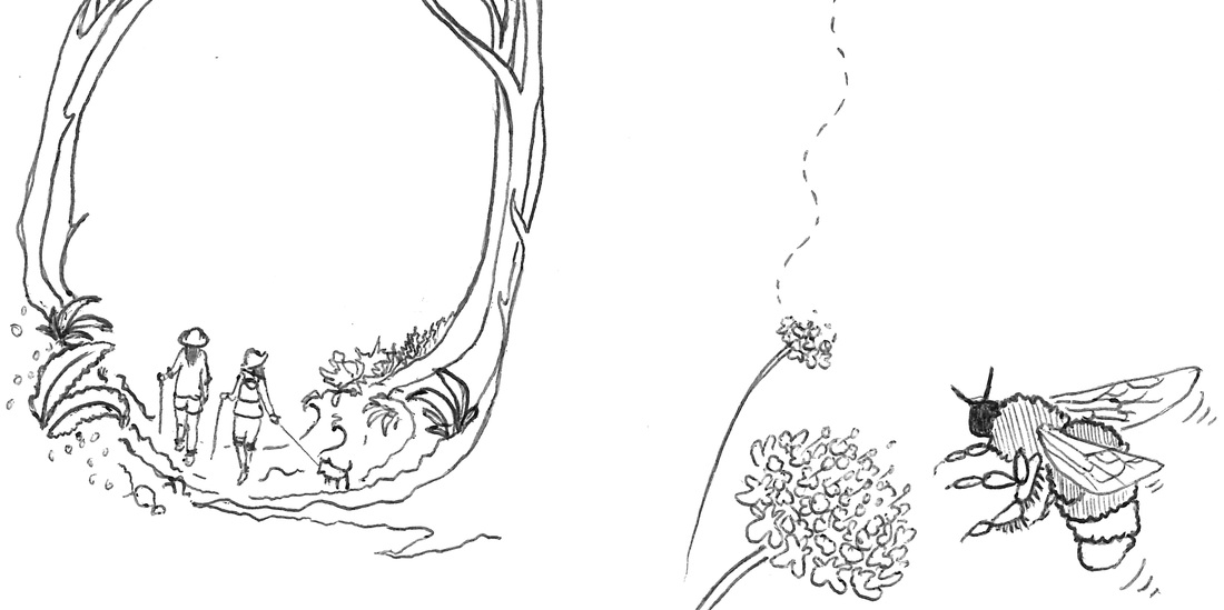
In terms of specific places, I worked from memory a lot of the time - not to create exact replicas, but to get the feeling of a landscape. In the "Meditate in the wild" illustration, the bay was inspired by the beach at Hastings or Bexhill (near where I live) looking towards Eastbourne and Beachy Head. In the sketch a wild landscape illustration, I drew on our walk along the Grand Union Canal. For other pieces, I looked at photos and films of relevant landscapes to try to create appropriate backgrounds. In the "Watch a wild webcam" picture, there’s an osprey in the foreground and a landscape inspired by the hills of midwest Wales in the background.
(Incidentally, I just read this great conversation between Sarah Perry and Amy Liptrot at Caught by the River, which includes a discussion about the difficulties in writing out of season - I can relate!)
In terms of specific places, I worked from memory a lot of the time - not to create exact replicas, but to get the feeling of a landscape. In the "Meditate in the wild" illustration, the bay was inspired by the beach at Hastings or Bexhill (near where I live) looking towards Eastbourne and Beachy Head. In the sketch a wild landscape illustration, I drew on our walk along the Grand Union Canal. For other pieces, I looked at photos and films of relevant landscapes to try to create appropriate backgrounds. In the "Watch a wild webcam" picture, there’s an osprey in the foreground and a landscape inspired by the hills of midwest Wales in the background.
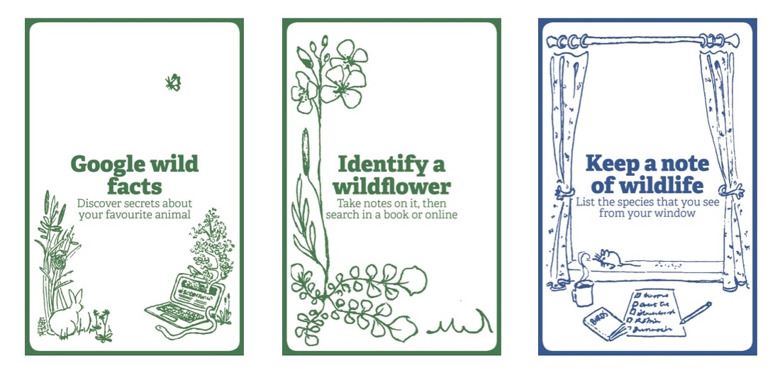
Left: "Google wild facts" took ages to get my head around. Middle: Can you identify that flower (it's edible)? Right: Cheeky mouse eating the bird food!
What is your artistic process for something like this? Straight in with the pen or pencil sketches first? What equipment do you use?
Interesting questions - though talking about “my process” makes me sound like I’m a pro, when I’m really not (this is the first time I’ve ever been paid to draw things, as far as I recall). As I said on Twitter, "Just have a bash at it!" is probably my first step.
All of the final images are black ballpoint pen on cartridge paper (sketchbook) - and a bit of whiteout, too! (That's Tipp-Ex or correction fluid to you.) There wasn’t a lot of reasoning behind that choice other than it’s what I had on hand when I began - and once I’d started I wanted to be consistent. If I did it again, I’d be interested to try out felt-tip pens. I knew the original images would be reduced a little in size for the cards, so I deliberately tried to keep them simple - lots of bold outlines, not too much shading. This also made them a bit like children’s book drawings, which appeals to me. I think Alison Lester’s artworks are gorgeous, and if my pictures captured even a little bit of the joy she is able to convey in her books, I’m happy.
For the first few images, I started with rough sketches and studies, but because pencil and pen are such different media (for me, anyway), I didn’t find that process very useful. As I continued, I tended to draw in proportions and light outlines with pencil and go at it with pen almost straight away. Some subjects required a bit more work, especially animals and people, where the proportions needed to be more accurate.
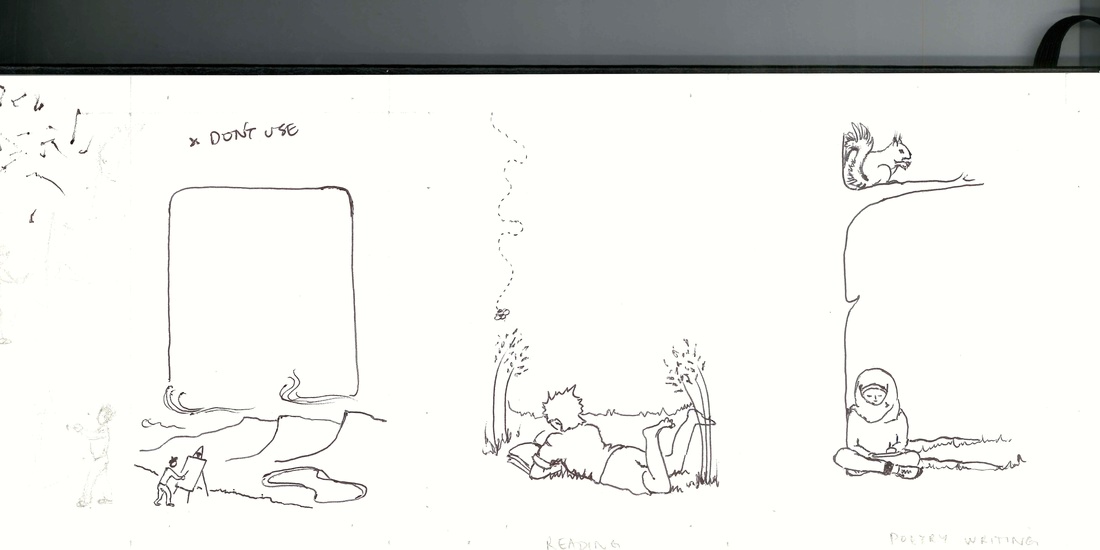
Left: Draft idea that I discarded. Middle: I want to be doing this right now. Right: Writing poems under a tree.
Were there any unused designs?
I ditched a couple of designs at draft stage, because they were boring or didn’t work for some reason. One of them was rejected as not being relevant enough to the text and I made a couple of spares just for the sake of it (again, I don’t think they were used). And then I did seven more on request that were to be part of the social media campaign - I haven’t seen them yet, though!
 I'll have to use the lily pads in another picture one day. | 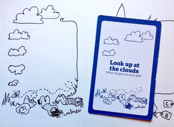 Another comparison between illustration and final product. |
Which illustration did you do first? Which is your favourite?
The first one I did, though I ended up redrafting it later, was the "Switch off to tune in" picture of the electrical cord turning into ivy. I was pretty pleased with that visual pun. It’s too hard to pick a single favourite, though. The pictures that were my favourites to draw aren’t necessarily the best images; and my favourite illustrations aren’t necessarily my favourite cards (some were changed around in the design process). But here’s a few . . .
- Google wild facts. As I said above, the idea for the image took ages to come up with, and it went through a couple of drafts, but ended up being one of my favourites.
- Read a wild book. I like the simplicity of this, the fact I’ve read in the grass so often and that the drawing came so quickly and easily (which I think comes across in the illustration; it doesn’t feel laboured).
- Pick up litter. Again, hard to illustrate! Mainly I liked finding somewhere to put bats and a bat box (I did an internship at the Bat Conservation Trust a few years ago, and I love the cute wee things!)
- Feel the wild between your toes. I’ve rediscovered my love of water over the last couple of years, inspired mainly by Roger Deakin’s fabulous book Waterlog. You should read it, then go and jump into a river!
- Write a wild poem. I enjoy how serene the poet looks and I hope the squirrel doesn’t drop something on her head! I wanted the people in my illustrations to reflect some of the diversity of the people who might take part in #30DaysWild. I know that when images of particular spaces (the countryside, boardrooms, clubs, new housing developments) are only ever populated by images of particular kinds of people (be that white, straight, young, able bodied, thin, cisgender, male, adult, rich, or whatever) it can send the message that those spaces are not “for” anyone else. I don’t want people to feel excluded from the natural world around them.
- Search for mini wildness. I spent a long, enjoyable time poring through mushroom books and fungi websites to make sure my tiny world was seasonally appropriate (even if all those species don’t grow in such close proximity).
- Look up at the clouds. Here’s one of the few where I prefer my original to the card itself. I like the story of the cloud becoming a butterfly (or vice versa), but I don’t think that comes across in the final design. I should say that I’m not at all miffed about this or other pieces being changed around for the cards - I was happy for the designer to do as they wanted with what I supplied. I’ve worked on the other side of this transaction and I know how time consuming and stressful it can be to have to get everything signed off by multiple people. Far easier for the folks in the middle if I handed the pictures across and let them do what they needed to do!
A couple of designs done for social media - I haven't seen them around yet!
Have you tried all the activities yourself?
No! I’ve managed a few of them this month and I did many more of them last year. One I really do want to try - hopefully more than once! - is a proper digital unplug. My partner and I go through stages of having a weekly screen-free evening, and that’s great, so a whole weekend must be even better, right? Think of all the books I could read! I wouldn’t mind setting up a bird picnic one day, too. And making a bug hotel. And making seed bombs (I love the idea of guerrilla gardening!). And, and, and . . .
So, how was #30DaysWild for you? Have you followed people's adventures on Twitter? I have been a bit slack documenting my attempts to add some extra wildness to my days. Hopefully I'll do a summary post sometime soon. Meanwhile, if you have any more questions about the cards, pop them in a comment below and I'll try to give you an answer!
 RSS Feed
